experience to inspire modern users
Revolution on Two Wheels : Reimagining Elby Mobility’s Digital Platform
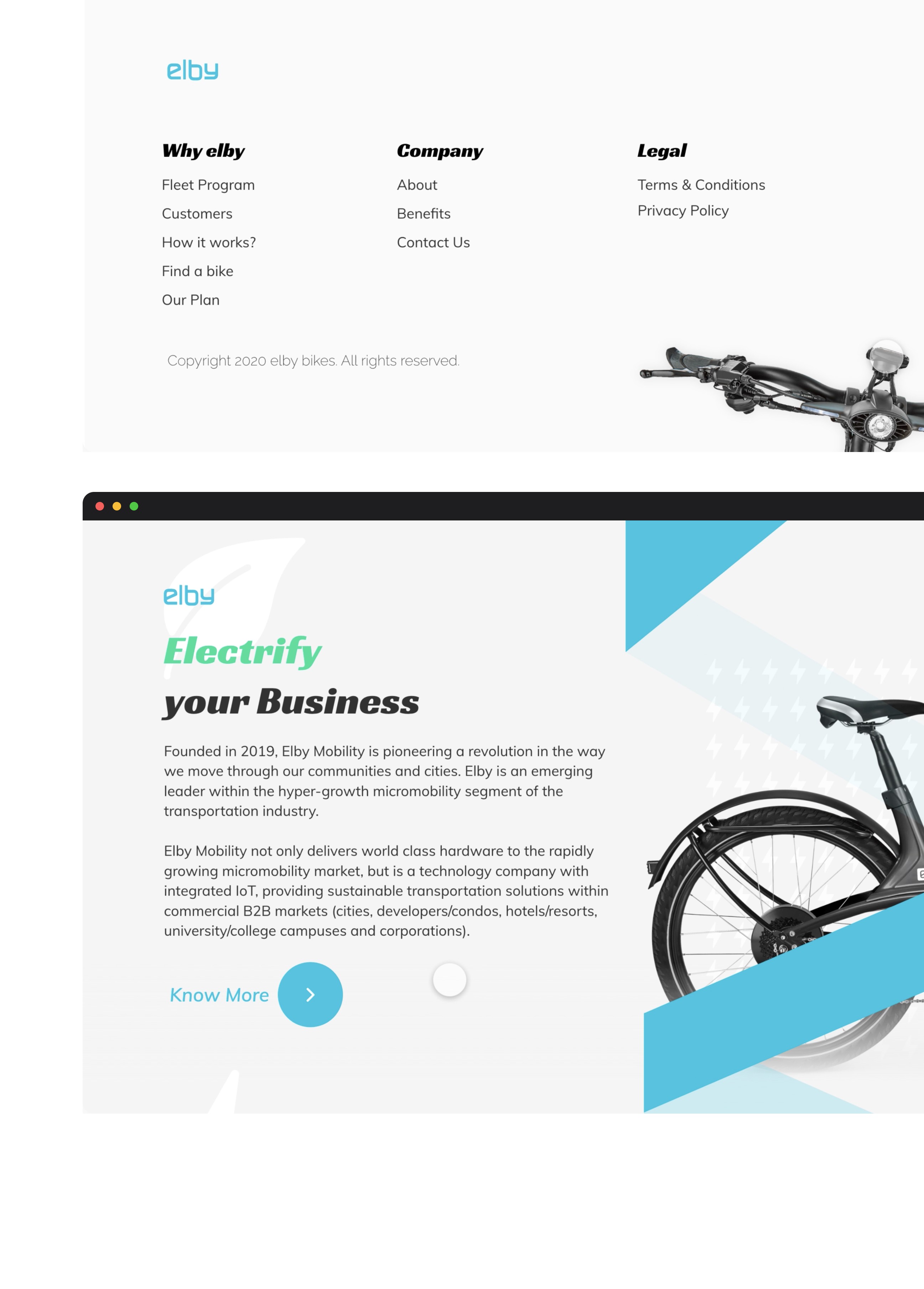
In early 2022, I led a complete UX and UI overhaul of Elby Mobility’s digital platform, a premium electric bike company innovating urban micro mobility.
Despite having an award winning product, Elby’s website struggled to reflect the vibrancy, modernity, and aspirational value of their brand. My role was to rethink Elby’s digital experience end to end: from first visit to final purchase or subscription.
The goal is to create a seamless, mobile first, conversion-driven platform that inspires sustainable living.
Clients
Elby Mobility
Award-winning electric bikes + IoT ecosystem for urban and campus mobility.
My Role
Lead UX Designer & Visual Designer
UX Research and Synthesis
User Journey Mapping
Interaction Design
Prototyping (Low → High Fidelity)
Visual System Development
Information Architecture
Timeline
4 weeks
Research and Insights – 1 week
Wireframes and IA Restructure – 1.5 weeks
High-Fidelity Prototyping and Stakeholder Reviews – 1.5 weeks
Tools
Figma (Wireframes, Prototypes)
Miro (Affinity Mapping, Empathy Maps)
Hotjar (Heatmaps, Behavior Tracking)
Google Analytics (User Journey Drop offs)
Slack + Zoom (Stakeholder Syncs)

Problem Statement
About Elby
Core Product: Electric-assist bicycles with 90 mile range + full IoT dashboard.
Target Audience :
Urban millennials (24–38 years)
Eco-conscious city commuters
University students and hospitality clients
Unique Selling Point :
Daily ride plans (affordable commuting)
Integrated maintenance tracking through app connectivity
Zero emissions, fully electric mobility solutions
Challenges & Solution
Content
No storytelling about daily rides, only technical specifications.
Insight : 67% of users dropped off before even reaching the pricing plans section.
Navigation
Confusing hierarchy; no clear user journey from exploration to purchase.
Insight : Bounce rate of 64% recorded on the homepage (Google Analytics data).
Mobile UX
Broken layouts, small click targets, non-responsive elements.
Insight : 61% of visitors accessed via mobile, but mobile conversions were 5x lower than desktop.
Brand Perception
Website felt transactional, lacked emotional storytelling or aspirational value.
Insight : User interviews highlighted missing "cool factor" and emotional connection.
Solutions Deployed
📌 Created user-centered navigation - Products, Plans, Learn, Community.
📌 Built seamless mobile first interfaces with large tap targets, sticky CTAs.
📌 Added storytelling layers - customer success stories, brand missions.
📌 Highlighted daily affordable ride plans upfront.
Research Approach
📍 User Interviews - 5 participants (urban riders, commuters, students)
📍 Heatmap Analysis - Old homepage behavior using Hotjar.
📍 Analytics Deep Dive - Google Analytics drop-off and bounce patterns
📍 Card Sorting (Closed & Hybrid) - 6 stakeholders (internal + new design lead)
📍 Hotjar + GA Data - 64% bounce rate on homepage, only 13% scroll depth to daily ride plan info., CTA buttons on mobile were missed by 47% of users.

Competitive Analysis
📌 First movers in the space, no real digital competitors.
📌 Legacy goodwill among youth and corporates.
📌 Need to maintain leadership by offering a world class online experience.
Defining the User Experience
Use Cases & Personas
Amelia - 27, Urban Commuter, Sustainability Advocate
Jay - 21, University Student, First-time E-bike Buyer
POV Statements
"Amelia needs flexible ride plans to commute sustainably without owning a car."
"Jay needs an affordable, stylish e-bike that fits his student budget and eco-values."
Design Execution
Information Architecture > Sitemap > Wireframes & Prototypes > Visual System
Card Sorting with team to define new structure :
Buy → Learn → Subscribe → Support → Community
📌 Paper Sketches → Lo-Fi Figma Wireframes → Hi-Fi clickable prototypes.
📌 Integrated sticky action bars for mobile (Buy Now, Book Ride Plan).
📌 Photo-Based Urban Lifestyle Visuals.
📌 Fonts selected - Racing Sans One (bold, active, energetic (for titles)), Muli - modern, clean, humanist (for body content).
📌 Colors : Greens (eco), Light Blues (tech), Minimal neutrals for luxury feel.
Testing & Feedback
1st Round
Header CTA too small on mobile - increased by 30%.
2nd Round
Confusing plan pricing - added "Compare Plans" sticky feature.
3rd Round
Missing Community feel - launched "Why Elby" success story banners.


Data Post Launch
27% growth in daily ride plan subscriptions.
Bounce rate decreased by 19%.
Mobile conversion rates improved by 2.3x.
Reflection
Redesigning Elby taught me that good UX isn’t just clarity it’s aspiration, emotion, and action combined.
In micro mobility, users aren’t just buying transport, they're joining a movement.
Working under tight timelines, navigating cross-team alignments (especially during IA decisions), and respecting strong stakeholder visions all sharpened my collaborative skills.
📌 Wins
Elevated brand from “product” to “movement.”
Achieved seamless mobile first UX.
Boosted subscription and conversion metrics significantly.
